|
Part 7: The World Of Sprites
 The main character's sprite...Possibly THE most important part of your game. Yeah, you can argue that "Oh no, the programming is more important! Without it there's nothing else!" or "No the scrolling engine! It makes things smooth!" or "It's the music! Music is more important than art! The music sets the mood in the background!"...But no one will see the programming, a nice scrolling engine doesn't matter if you're scrolling over a picture of stickmen, and the music only sets up half the mood. If you're putting out advertisements or anything, making the back of your game's box because it's so amazing that it's going to consoles or whatever, you can't put music on it...Nor programming...You're down to screenshots. Screenshots are what people see first, and that's what they base their opinions on instantly, regardless of whether they realize it or not. If they check out a shot and see stickmen walking on circles of tiled grass, they have in their mind "Ugh, what an ugly game..." and when they play it (IF they play it...A lot of people won't even download or check out a game if the screenshots are ugly) they go into it thinking "This is an ugly game..." and the wonderful music and scrolling engine and programming you have are all ruined because the player is playing your game only half caring. Art is EXTREMELY important in making your game, and yeah, you CAN get away with ugly stickmen...But you'd better have one incredible plot, because you're going to have to make up for that. And even if you have the most amazing plot in the world, it's not going to matter if people don't sit through your ugly graphics long enough to find out about it.
Now specifically, the most important sprite is the main character's sprite. "Why that one? What about my super evil arch-nemesis bad guy set to take over the world for some unknown reason?" Well, he's important too, being an important character in the plot, but he's not as important as the main character. Why? Because the main character is what the player is going to be looking at for the entire game. They might walk through 40 different types of tilesets and journey all over the world and everything, but the one constant graphic is going to be that main character's sprite walking along. If the player doesn't find the main sprite appealing, and even finds it kind of ugly, he's not going to be very enthusiastic about playing because he doesn't care about the character...And if he doesn't care, the plot won't have as much effect on him, and he might not even finish playing the game because he just hates looking at the main character's sprite so much. Yeah, it's not a very bright way of playing a game, but why would I play a game where I hate looking at "myself" when I could go play another one where I'm a wicked looking knight or a mysterious looking mage or something?
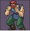
Okay, so I think I've made my point...The main character's sprite (and everyone else in the party if you have more than one) is the most important. So where do we go from here? Well, let's talk about limits...and then how to get around them. Here are some quick sprites I did up from that one up above:
 Okay, so you're Mr. Game Artist...And you're working with a programmer who wants you to make up the sprites. So you come up with the first one...39x54, but it's really pretty irrelevant. This first sprite is the equivalent of drawing a rough sketch of something on paper to plan out what you're thinking. From this big sprite we can see how all the armor goes and everything. But of course, unless you're working in SVGA, a sprite this huge is probably not going to be used (it'd take up way too much of the screen). So you decide to chop it down a bit...Okay, about in half, down to 24x28. Now it's a more realistic size, and the programmer won't be laughing his head off and then kill you for expecting him to use huge sprites and keep the engine running fast. The main problem with this sprite, however, is that 24x28 is a weird number (you'd have to have, maybe 24x24 tiles or something...Using rectangular tiles gets hard to work with for complex tiles, and if you have a character sprite that's a certain size, you usually want to make your tiles close to that size (at least the width, height isn't as important) otherwise you have to have doors made of 4 tiles and such, which get aggrivating when making maps, and you can get messed up when you try to align things)). SO, you decide to whittle the sprite down some more...Down to good old 16x16.
16x16 is the old "general" size of sprites. This is what Final Fantasy and tons of other RPGs used to use. It has something to do with sprite sizes that are powers of 2 being quicker to display or something...I don't really know, heh. But it was a nice number because it would allow somewhat large tiles to allow detail, but not too large to slow the engine down. Through time, it's just become a tradition to use 16x16 for some reason (the limits these days are pretty non-existant when it comes to this kind of thing...You could probably get away with using the first huge sprite on the left if you wanted and not have to worry). Anyway, I've redrawn him yet again, shrunk down to 16x16 on the right...So now he still "feels" like the large one, but he's nice and small. However, what happened to the sides of his armor? The 3 sections to his gloves? The triple boot thing? His belt buckle? They're all gone!
That's right, they ARE gone...We've run into the limit of sprite size. Now really, this isn't much of an issue these days, as I've said...As you can make sprites pretty much whatever size you want. However, having an understanding of how to work with tiny sprites will make working with large sprites not only MUCH easier, but it will help you develop a style and learn how to make them look better. Check out the middle size sprite...It's basically ugly (heh, I didn't intend for that, but the more that I look at it the more I hate it). The character is stumpy and off balance looking...It just looks cluttered, and it's hard to see what goes where. The reason for all this is that everything has an outline. EVERYTHING. Every piece of armor and such. And it looks bad because there's too much black crowding in places and in general it's just not working...
So the big question is "Well if I don't outline everything, how am I going to show different parts of the sprite?" The answer to that is to use colors strategically. If you're drawing a character with a cape that comes around the front, you don't need to outline the cape with black to split it apart from the clothes underneath. All you have to do is figure out what color you can use to contrast it the right way. Basically what you want is to SUGGEST details. Just like you don't have to show each individual finger to represent a hand, you don't have to show each individual section of clothing to represent it. You just need to suggest the feeling of it. And this is used everywhere...Though nowadays with sprite sizes being pretty much unlimited and most of it all switching to 3d anyway, it's not really a common thing to see anymore, and if it IS used, it's probably just a style choice of the artist. In the old days though, when it was necessary to have smaller sprites but still show off detail, it was used often. For instance, let's check out some sprites from Final Fantasy 2 and 3:
 First up is the coolest character in any Final Fantasy game...Kain, the Dragoon Knight! Heh...Now check out that sprite...It looks good. You can tell he's got dragon-spikey-cool armor going on. But take a look at his leg, in the front view. He's got red (uhh...Pants? Spikes? I don't know, heh), and then blue boots...But they're not divided by a black line. And yet, you can still see there's a difference between them. This is a basic example of using color division (ooo, I made up a term, heh) in sprites. Also check out his feet. There's no black line along the bottom of them...They just suddenly "end". The reason is that there doesn't NEED to be a black line there. Because there are black lines on the sides of the leg, your eye automatically draws an "invisible" line connecting the left side to the right side, using the end of the colors as an edge. Now it may not SOUND like much, but that means an entire row of pixels was saved...That row can be used for doing details on the face or other parts of the body, instead of wasting it just to outline that foot, when it's not even necessary. Another small part would be the red "eyes" on his helmet. They're just red on blue, no black. A final section is the top of his helmet. On the front and back views, there's no black line on the very top. Again, that would take an entire row for it and it's not necessary. Your eye says that because the blue in the middle sticks up above the blue beside it, it's higher, and since it's got black surrounding it, it's also flat and a part of his helmet, and not just a random blue pixel flying by behind him. Kain isn't a great example of extreme color division (usually cloth requires it more than armor does because armor is so segmented and usually doesn't have much color difference on the sections), but he's cool, and so he gets to be on here, heheh...Next up:
 A random NPC from a town! I only grabbed these two views of her because the others didn't have much that I wanted to show. Now the MAJOR place that you'll see color division is hair. Check out her hair...There's no black line that divides the red of her hair from the peach of her skin...But you can tell her hair isn't just sunburnt skin, right? There's enough difference between the two colors that a black line isn't necessary. Plus if there was a black line, imagine what that would do to the eyes! You wouldn't be able to tell what's part of the eye and what's part of the hair! By using color divisions, the hair/face fall into the background, becoming less important than the eyes, which are used for expressions and such. Now check out her torso chunk (from the neck to the waist, including the arms). The only black lines there are the ones that outline the full piece...They're on the "outside" of the area. No black lines come in and cross the "inside". Again, there's no lines outlining her blouse and her skin, but you can tell she's wearing something, right? See, when you're working with bodies that are like 2 pixels high, you don't have the extra space to outline everything...And like I said before, sometimes outlining everything just makes the sprites look crowded with black, and the black can overpower the color, making your sprites look more jumbled. The last point is her hair, where there's the yellow tying thing (heh, I don't know what it's called, just go with me here)...You know what it is, and you know it's there, even though it's not outlined. Am I getting the point across? Heh...Now there ARE some black lines that cut through the inside, namely the line of the jaw and the waist...THESE are necessary, because they segment the character. If you have NO black lines dividing pieces, then it looks like a large colored blob of pixels...This is a mistake a lot of people make...Not ENOUGH division of the sections. Be careful on this...It generally just takes practise, learning what parts of the sprite to emphasize and what parts to blend. Next let's take a look at the battle sprites...
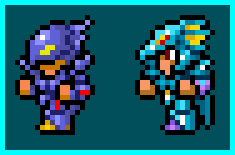 Cecil and Kain, snatched from the battle scenes of FF2. These sprites are 16x24, unlike the map sprites which are 16x16...Because of this, they're much more detailed...And YET...They still use color division...See, Mr. Artist gets a whole 8 more pixels to work with now. "Ooo!! That means I can put in all the black outlines!" Well, you COULD do that...But what you'd end up with is basically your 16x16 sprite, but with black outlines separating everything...And really, it wouldn't look much better than the 16x16 sprite, which means you might as well save your programmer some work and just use 16x16 sprites. "I don't want to do that! I want fancy sprites!" Okay then, listen up and study these sprites...
First up is Cecil on the left...Now the main part that sticks out is his helmet...Check it out, notably the piece that covers his eyes...Follow the black line. Follow...follow...oop! Where'd it go? It just stops! That's right. From just past the middle of his face, the line becomes a dark purple line, goes through and shapes his helmet, then attatches back up to the black line at the top. "So what was the point of THAT?" Well, it has to do with contrast. If you glance at his head, the first thing your eyes focus on is the front of it, his facial area. Then your eyes scan around to the back and take in the whole thing. The reason your eyes point to one spot first, is because of the collection of black that's there. If that purple line were black, it would stand out and fight the face for attention, which would make the face seem less important (I know, this all sounds hokey, but trust me here, heh...). Because it's purple, it fades in with the rest of the purple armor. Squint your eyes and look at the sprite a bit...The purple areas all seem to blend together, because they're similar, but the black areas still stand out on their own. Okay, so you don't have to get THIS technical and philisophical about the lines...But just keep in mind that you don't always need BLACK outlines. Now check out his arm (the one that's closest to us)...Again, you can see there's no black lines from the shoulder down to the hand...It's divided with colors, and you can see there are divisions. Also on his chest armor, his legs, and so on. It's all done with color separations...Dark colors used instead of thick black to divide things.
Now Kain, because he's also wearing armor, is similar to Cecil in where the colors are used. In fact, if you look close, his legs are exactly the same as Cecil's except that the colors are changed, heh...While we're on the subject of the legs...Check out Cecil's, then Kain's. Notice the difference? The bottom right corner on Cecil has an orange spot and a corner pixel. Now if you look at them, those TWO pixels change the look of the boot almost completely. Kain has rounded solid boots, whereas Cecil has an orange part sticking back (possibly his heel?) and the armor is sharp-cornered, like jagged. That orange pixel has no black outline...It's just an orange pixel, but it changes the look of the armor. Okay, so now check out Kain's helmet...The dragony fin part...The black outlines the back, and the inside is just alternating aqua ad yellow. There's enough difference in the colors that they're separate looking, and there's no black outlines on them, which would crowd up that section of the helmet and make the sprite look ugly. Kain has some more divisions (most notably on his forearms), and the black lines make his armor feel like it's solid on top...Cecil's purple armor, right on the wrists, seems more like a sleeve, while Kain's is a separate segment, thanks to the black line. Black can divide things up, but it can also make it hard to tell what's going on. Again, it'll take practise to learn how to use black like "the masters", heh. So now we'll check out Final Fantasy 3:
 It's good old Edgar...Fully decked out in his fancy clothes. For a bit of useless information, the character sprites in FF3 are 16x24, the same size as the battle sprites in FF2. Also, in FF2 they switched between 16x16 sprites for the map and 16x24 sprites for the fights, whereas in FF3, they just use the 16x24 sprites for everything. I guess they made the battle sprites in FF2 and fell in love with their look or something, heheh...Anyway, these sprites use massive color division. In fact, oddly enough, the larger sprites use it more than the smaller sprites do, heh...The lesson from that? Using bigger sprites doesn't mean you don't have to still think about what you're doing. All those black lines you blob around each individual strand of hair could be used as shading or details...Think about it as you do it. So now, to get to Edgar...The main thing to check out is his hair...Specifically where it falls down on the face...Just dark strands, no black outlines. As well, note the very top of his head. He has a part in his hair...That one black pixel is missing. Logic tells us that if we want a bump down in the hair (for the part), we should have the black line bump down...But we don't need that. All we need is to eliminate a pixel and break up the line. When your eye is travelling along the top line of the head, it comes to the break, dips down until it finds color, and comes out again, following the shape of the pixels...That creates the dip in his hair, and doesn't take a big fat black pixel. Watch the green lining on his clothing too, it's just there, no black outlines...Black outlines would make the lining (especially on the cape in the back view) stand out too much and start to look like a separate piece of clothing/armor. On an interesting note, there IS no black line on here, technically. In FF3 they went with colored lines...If you get close up to the outlines, you can see a tinge of green in it. Because of this green, the sprite looks a bit more "realistic" than the FF2 sprites, which look like "drawings" because of the harsh contrast of black. This green softens the look out. The final note for Edgar (there are other things but I'm assuming that by this point you're already looking at the sprites and finding things on your own, for that's how you'll learn) is that there's no separation between his legs in the front view. This is, unfortunately, an inconvenience of using even numbers for sprite sizes (16 for the width). Programming-wise, calculations are faster if the numbers are even, so it was standard practise in the old days to use even numbers on the sprite sizes. The problem with this is that there's no middle column of pixels, and thusly no actual center point on the sprite...If the sprite had a middle column, you could have a line going up it at the legs to separate them evenly, and maybe even throw in a nose between the eyes...But because there are two middle columns, you can't have a line dividing legs unless you either shrink your whole sprite's width so that there's a column of blank pixels on one side, or you have uneven widths for legs. The double column problem also affects the faces, which is why if you check out Edgar, he's got one short eyebrow and one long one...If both eyebrows were long, it would turn into a unibrow, heheh. If both were short, he'd look happy-go-luck, and he's usually burdened with stuff...So the one pixel there makes it look sort of like he's trying to figure something out. Okay, that's enough of Edgar...Let's check out the next character, Terra:
 So by now you should have the usual "checkpoints" memorized...Check out her hair, the top of her head with the missing pixel, her legs, and her torso. Something to note, after you're done all that, is her chin...There's no black line across it, dividing it from the body. If you remember the NPC from FF2 above, there IS a black line...So why the difference? The NPC looks like she's an overweight woman, like a generic medieval mother. Terra, however, appears to be thinner and in better shape. Part of the reson for this is her chin. If you think about a fat person's head, there's usually a double chin dividing the head from the chest...And if you have some fat, and fold it, you get a crease...a dark line. So on the NPC, there's a dark line that separates her head more from her chest, making it feel more segmented, and more like there's a large flat line dividing it...a line of fat, basically. Now in Terra, she's thinner, so instead of a thick line, she's just got a few darker pixels. It shows that there IS a chin there, it's just not a very definate chin. A black line could also be used on characters with square jaws (usually big barbarian type people), to show the definition. The lack of a heavy line, much like a pointed chin, makes the character look more feminine. Now we'll move on to Locke:
 The main things in Locke are, like the others, the hair, the legs, the torso, the headband, etc. Now Locke seems to be more divided because he has that funky jacket on...But yet, if you look close, drawing a curved line following his body from one hand to the other, there are no black pixels! The color change is so drastic between the blue and the peach, however, that it feels like it's divided. Now if the dark blue on his jacket was replaced with black, his jacket wouldn't be a wide blue jacket, it would be a black jacket with a thin blue stripe going up it...Another plus of not overdoing the black on a sprite. On the back and side views, the tied parts of his headband are outlined with black, while the part around his head isn't...Why? Because the tied parts stick out from his head, and they're different segments of him...The headband is tight around his head, so it doesn't need to be defined separately. Now do you see where all this is going? If you haven't got it drilled into your head now, then let me state it again..."You do NOT need to outline everything." Now the next time you're playing some games, and see some sprites, check out where outlines are used and where color separations are used...You'd be surprised how many sprites DO use color separations.
Contents:
Author of this page had got the permission to host this tutorial here. To have this tutorial at your page you must seek permission from its author.
|