|
Part 5: De-Mystifying "The Greats" (Part 2)
Next up is the amazing and almighty Final Fantasy 3. Hailed as the best looking of the original FFs, and with good reason, as you can see:
FF3 is less extravagant than Secret of Mana 3, but SoM3 was made later so that's to be expected. Anyway, FF3 isn't QUITE as impressive but nonetheless if you can do graphics like this, then you should be writing this tutorial, heh. Anyway, we're here to learn from these screenshots, not oogle them, so let's begin with the top left one:
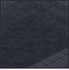
 This is a floor tile from the main sections of town. I've got a tiled version, a slightly blown up version, and a 900% version, heh...Ignoring the brown rocks for a moment, the grey rocks consist of...guess how many shades...4. Surprise, surprise. There's not a whole lot to say about this tile, but notice how the darkest shade is used to shade each rock...just a one pixel thin line here and there. Each rock is then made up of the other shades. Study this for yourself, heh. But take note of the tiled version...Can you tell it's tiled? Yeah, you can. BAD Squaresoft! BAAAAAD!! But, because the rest of the game looks just so good, we'll let it slide this time, heh...But as you can see, using the rock in the tile makes the grid once more appear. To counter this, they should have had a tile with no brown rocks, this one with both brown rocks, and one with just one brown rock, maybe in the bottom left or something, somewhere slightly different. Listen to me, I'm actually criticizing Squaresoft, heh...So moving on, let's talk "interesting" for a moment:
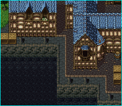
 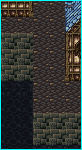 Take a look at the shot on the left. It's interesting...but why? Well, it's the attention to detail. Of the stuff I've seen, people who try to do a section of a city like this, leading into water will do something like what you see on the right. It does the same thing, it shows the city drops down into water...But it's so boring to look at compared to the other one. The other one has not only the blue tinged slated rock path, but the orange brick outline as well as the "lining" of bricks that completes the look of the bricks laying up onto the top. As well there are pipes thrown in here and there, for even more interest. Also notice the part that drops into the water. In the right shot it's just the same tile, then water. But in the left, the top set of side bricks is normal, the next row is a bit darker, and then the water overlaps the bricks, creating a sort of translucent effect, making the water seem more like water and not black oil or something. Just wanted to point this out for a second. So let's move on to the second shot:
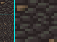
 The big question on everyone's mind is probably "How in the world did they do those ROCKS?!" I honestly have no real idea...I could probably go and divide up all the tiles and find out which ones they use where and just how many make it up, but I'll leave that as an excercise for you, heh...If I went and did things like that, I'd be writing this tutorial from my grave and still be nowhere near done, heheh. However, taking apart the colors, they're made up of about 7 in total...From the lightest purple to the darkest black. To get the flat look, so it's sort of like rectangles of rock jutting up, notice that they used the bright colors only on those flat areas. The flat colors then dramatically switch to darker ones and black is used for the shadow, while darkening lines drop down into the shadow to give it the 3d effect. Heh, that's all I'm going to say about these rocks...I wonder how long they had to lock the tile artists in the basement before they would actually try to tackle this set, heheh. The rest of this is pretty much made up the same way as the other parts...Around 4 colors per tile type. Take the image into a paint program and zoom in and do some analyzing. Now for the third shot:
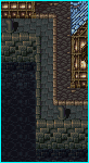
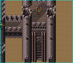 In this one I also want to point out the attention to details and interest. Check out where the door area is. It's not just a solid wall with a door in it and then the upper floor. It's got the door, surrounded by large pipes, a fan above the door, steps leading up to the door, those...support...things (I don't even know what they are, but they look good, heh) above the pipes, then larger square bricks, and THEN the upper floor, which is also surrounded by a brick border. As well, on the left joining chunk, there are those triangle patterns on the side of the bricks, it's not just the same brick tile as everywhere else. Even more detail, on the columns beside the pipes, they're not just columns, but they have those bricks that stick out, the hinge things near the bottom, and then grates at the very bottom (again, I have no idea what they're for, but they make it more interesting to look at). Of course then they go and ruin things by using that desert tile over and over and over in the desert...Some rocks or dead trees or something would have been nice to break the areas up a bit. Here's a closeup of those columns:
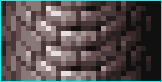 These tiles use 9 colors, but they're all shades of grey and are used all over the place which makes them less of a waste (if you used 9 new shades for each tile, you'd soon run out on a 256 color palette). Notice the far left and far right sides...The bricks are made up of only 2 or 3 colors, and they're the darkest shades, whereas the middle bricks, the lightest, have the bright shine and use more shades. The less detail, the more it feels like it's in the background (remember the grass feeling more flat where it used only two colors earlier in the tutorial?). Now for the final shot:
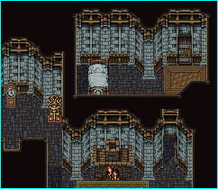
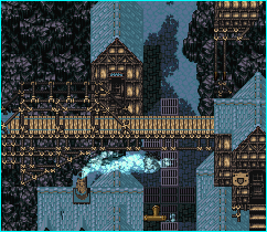
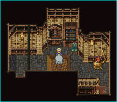 Here's something I found amusing that I hadn't realized until I began actually LOOKING at the tiles...Notice any similarities between these two rooms? They're both from different towns, and they both have different "feelings" (the left feeling more cold and lonely, the right feeling warm and friendly). They use the exact same tiles, with different colors. And it works, because they're used in two totally different towns. By the time you get to the second town, the tiles in the first aren't fresh in your mind anymore, and often you won't realize they're using the same tiles. And this probably saved hours of tile drawing, heh...While they're the same underlying tile, you can tell one town's houses from another because of the palette swapping. Well then, let's take a section of the wall and look at it tile by tile:
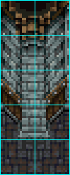 Here's one of the columns...At first glance, it looks like a column is just a column of tiles going up...But it's actually made up of two tiles, which is actually more efficient. If it took 1 column of tiles for the middle flat bricks, then it would take a column on both sides for the diagnol sections. By using two columns, the diagnol sections are part of the middle column's tiles, meaning they can fit more onto one map because it takes 1 column less. The problem with this method though is that now the only way to have more than one diagnol column in a row (to make a section of the house that goes diagnol for more than just that small chunk), they'd have to make a special repeatable diagnol brick column and use that. However, none of the maps do that, they always have these sections that stick out only 1 more tile. If you look at the screenshot of the room above, you can see that to do a corner border (like the column that would go to the left of the section I divided up), they use only HALF of the column. So they have two halves again, and to do a large beam in the middle of a wall like right above the bed, they simply put these two beam halves together back to back to make it. It's all in the setup, people, heh. Anyway, I just wanted to point out the make-up involved in this section. If you do some color counting (you'll be doing this a lot if you're interested in becoming a better pixel artist), you'll notice, again, except for the few really black pixels, only a few shades are used.
An interesting feature of the inside maps is the upper layout...This is more evident in the shot on the right up above. Check out the corners...they have those double beams that cross the corners, and once in a while there's that beam that goes vertically above everything...As well the borders never go from just inside tiles to black tiles. There's a wood frame outline around the entire room. Again, it's attention to details like these that make things interesting. Also note the "upper" beams and such are done with dark shades of brown, not light ones. If they were done with light ones, they'd be too distracting and ruin the rest of the map. As well, if the lamps on the walls were underneath the beams like that, the tops of them wouldn't have light shining on them, so it's realistic as well. But mostly it keeps them from blending in too much with the rest of the background.
Okay, so enough with the analyzing. I could go on for hours picking apart games like Chrono Trigger, Zelda, Shining Force 2, Phantasy Star IV, and so on but it would take forever and I'd be doing all the work for you...From all this, you should have learned how to take apart a map and see just how it's made. Take note of the colors used, how the sections are divided up, and the different types of contrast and color selections chosen. In time this will become more natural and you'll be able to figure out how many shades or tiles are used from just glancing at the map for a few seconds. This skill is VERY important in advancing art-wise.
Contents:
Author of this page had got the permission to host this tutorial here. To have this tutorial at your page you must seek permission from its author.
|